
Overview
Color palettes are used in every aspect of daily life and loved by people everywhere. Color is an incredibly complex topic that can take years to master, but yet using colors in any aspect is something that everyone can enjoy. Brilliance can help users of all skill levels manage their use of color in their art.
User goals
• Create color ideas
• Share color palette ideas and see other users ideas
• Explore applications for those color palettes
Problem
Other color focused apps in the market focus on catering to users who already have an understanding of color theory. Those applications only provide a few ways to create a color palette and little else, which leaves these apps to be confusing to those who did not have formal training in art. Many of these application also do not allow users to see and share ideas, failing to capitalize on the social aspect of color and art.
Solution
The goal of Brilliance is to provide a platform for users to create, share, and express their color palette ideas. Brilliance will have features that seasoned artists will need, while still being approachable to users first learning about uses of color. The end goal to to create an easy to pick up experience for artistic ideas to quickly flow through and be realized, and allow a platform for those ideas to be shared with all the users.
Some of the features that Brilliance will have in order to meet user goals are:
• Give users a platform to save and share color palettes with other users.
• Give users a way to create palettes from scratch or through an image.
• Assist users in color pallet creation by giving them different ways to find and select colors.
• Give user info on colors, such as hex code or CMYK values that will be useful for using the colors in other settings.
• Customize the user’s experience of color pallet creation by suggesting colors and harmonies that fit a user’s preference
• Give users a way to test their color pallet in a more real scenario by demoing the color pallet on images.
Demographic Research
Target Audience
Other color palette apps design their app with a focus on designers. People who already understand color and its various forms in digital and tangible applications. While this is an important audience to pursue for this kind of app, not only designers use color. Hobbyist enjoy and engage in art just as much as designers. The other color palette apps on the market do not target this group in their designs, which makes their app a lot less useful for them. I looked into the demographic of hobbyists online to begin my research.
Pinterest
• 250 million active users
• 125 million in the US
• 81% of users are female
• Most popular category in the US is Art, Art Supplies & Hobbies
• Majority of users are millennials
Tumblr
• 69% of tumblr users are millennials
• 51% males 49% females
• Art is the 4th largest category on tumblr Illustration is 6th
• 62.5 million people participated in crafting activities in the US
User Personas and Scenarios
Niesha Myers
Niesha Myers is a work from home mom with two kids in high school. With more free time now that her kids are older, Niesha has taken up painting again, but needs inspiration for her color choices.
• Age 43
• Lives in Chicago
• Has a degree in financing
• Always painted as a hobby, never went to school for it.
• Has a great passion for art and color
Scenario
Niesha has taken beautiful photos from a family vacation, and she wants to make a painting from the colors from the picture. She needs to make a color palette from her photos to use in painting later.
Mary Sherman
Mary Sherman is a illustrator who specializes in illustrator vector art. With her busy line of work, she needs a way to test and save color palettes to use in her work.
• Age 25
• Lives in San Francisco
• Has knowledge and passion for art
• Has a degree in Illustration
• Works as a freelance artist with varied clientele.
Scenario
Mary has some colors in mind for a piece, but she needs idea for more colors that can work together. Using the color search feature she can quickly find colors and make palettes to use at work.

Olivia Yu
Olivia is a high school student who enjoys drawing in her free time. She recently started drawing digitally an really exploring her art. She needs a platform to learn more about color and how to use her favorite colors effectively in her art.
• Age 16
• Lives in Washington State
• Good student
• Focuses on hobbies and friends outside of school.
Scenario
Olivia is looking for color palette inspiration from what others have posted, and favorite those palettes to use later
Interviews and Testing
Testing of the task flows was done with hand designed cards for each page of the app. The pages were done like this for testing to allow the user to move the pages in the after testing interviews that were conducted.
The goal of these sets of interviews was to test functions, overall site architecture, and legibility of layout of pages.
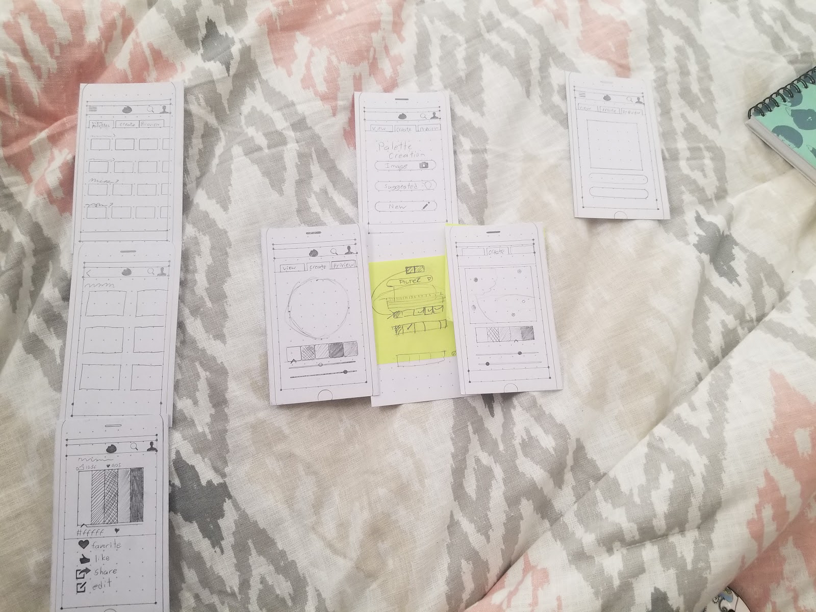
Testing
Three users were tested with the task flows.
User 1
• Tasks one through three were all completed successfully and without confusion.
• Task four had the user hesitated and confused during steps 6 and 7. They couldn’t find where the palette was and they didn’t know what colors to press. (the color choice didn’t matter for testing, but the confusion was still noted). They could not find the check mark to finish step 7.
After testing I talked to the user asking for feedback in the form of a casual interview, notes on the interview are taken below.
• They found the majority of the tasks to be easy to follow and liked the functions.
• The layout on the majority of the pages was well liked.
• They found the wording on the buttons on the create palette page to be a little weird and suggested different names (the buttons were still easy to follow with the task though).
• The “Color assist” feature was met with the most confusion, and the layout on that page was the most confusion.
• The functions of the feature were unclear, but through discussion of the feature it was revealed that the naming of the feature was the most confusing part.
• They suggested adding a circle to the check mark to increase visibility.
User 2
• Task flows one through three were completed easily.
• Task flow 4 took a little longer and step 7 had them stuck for a little bit, but they completed the task.
After testing it was opened up to a casual interview.
• The user liked the features that were tested, and most of the layouts and functions were clear.
• The user thought the wording on the buttons was a little weird
• The user suggested some layout improvements for step 6 of task 4, by moving the palette slots to the bottom of the screen, next to the check icon.
User 3
• Task flows one through three were completed easily.
• Task flow four had the user confused on step 7 and they couldn’t progress.
After testing it was opened up to a casual interview.
• User had some suggestions for features in task 3, like adding a way to change the value of the color quickly
• Loved the features in the app as an artist.
• They liked the feature in task four when explained the intent, and they expressed issues with legibility of the last page.
Testing thoughts and Summary
Overall Testing of task flows 1 through 3 went very well and users were happy with those functions. Task 4 had the most confusion, a lot of it was with legibility and the layout. Overall legibility of the buttons needed to be improved, but the core of the tasks and the app architecture overall was well received. When going back into designing, the focus was on making the text of the buttons clearer, and task 4 was revisited and redesigned.
At this point the wireframes were digitized to allow for easier tweaks, and color was added to bring the wireframes to a low fidelity state. I also added in between pages on task flows (showing permissions of the app), and expanded the functions and added pages on a few task flows. The task flow steps were changed to compensate the added pages.
Final Designs and Prototype
The only additional feedback given was to add functionality of naming the palettes in the task flows. I overlooked this feature in planning and added it back in before going to high fidelity pages. I also added in feedback functionality into the prototype. None of my users talked about it but having feedback to show a user that something was saved successfully was important and something that couldn’t be tested easily in wireframes.
Task flows
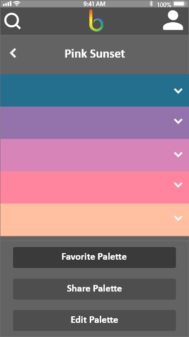
Task Flow 1: Color Browsing & Favoriting
• Start at main page
• Tap the “View Palettes” tab
• Tap the “popular Palettes” category
• Tap the “pink sunset” Palette
• Tap the down arrow on the color purple
• Tap the heart icon
• Tap the “favorite palette” button
• Tap logo to go to home page (task finished).
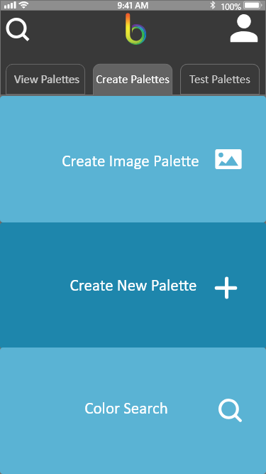
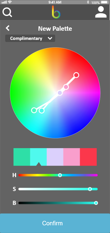
Task Flow 2: Color Palette Creation, Color wheel
• Start at main page
• Tap the “Create Palettes” tab
• Tap, “Create New Palette” button
• Scroll down and tap “Confirm” (For testing purposes, the color palette is pre created).
• Tap “New Palette” or the pencil icon next to it to change the name.
• Type in new name (for testing purposes the name is pre-created).
• Tap “Save Palette” button.
• Tap logo to go to home page (task finished).
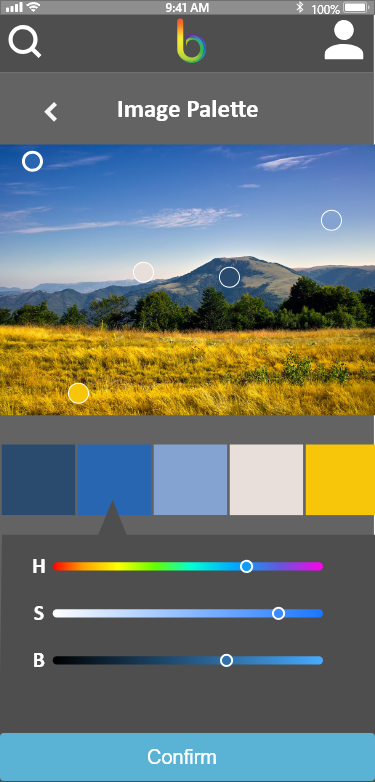
Task Flow 3: Color Palette Creation, Image Palette
• Start at main page
• Tap the “Create Palettes” tab
• Tap “Create Image Palette” button
• Tap “Allow” to give app permissions (first time only).
• Tap the middle image on the second row.
• Scroll down and tap “Confirm” (for testing purposes, the color palette is pre-created)
• Tap “Image Palette” Or the pencil icon next to it to change the palette name.
• Type in new name (for testing purposes the name is pre-created).
• Tap “Save Palette” button.
• Tap logo to go to home page (task finished).
Task Flow 4: Color search feature.
• Start at main page
• Tap the “Create Palettes” tab
• Tap the “Color Search” button
• Tap “Filters”
• Tap “Apply Filters” (for the purposes of testing, filters have already been selected)
• Tap the color blue on the top left to add it to the palette. (for the purpose of testing, the color palette is pre-created and all colors are added to the palette).
• Tap the check mark logo to finalize the palette.
• Tap “Palette Name” Or the pencil icon next to it to change the palette name.
• Type in new name (for testing purposes the name is pre-created).
• Tap “Save Palette” button.
• Tap logo to go to home page (task finished).
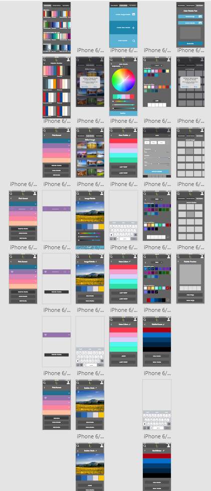
Key Pages
Final Thoughts
The final App prototype has four complete task flows in it, that showcase the apps main features.
• Browsing and favoriting user submitted palettes.
• Creating color palettes from images.
• Creating color palettes using a color wheel.
• Creating color palettes using a color filtering system.
These four features are the results of all of my research and testing. If I were to continue with development I would continue to fill out this app’s functionality by creating a user profile system where users can see their created and favorited palettes and colors, and post palettes for other users to see, as well as a search feature where users can find the exact color they are looking for. Those two features would be the direction of any future development.
Overall I am really happy with the results of the prototype development. This project was outside my comfort zone a bit, and something I never saw myself doing before. I learned a lot over the coarse of this project and i’m confident I can take these skills and use them, not just in other interaction design, but in my other work as well. Creating my app, Brilliance, was a wonderful process and I hope to visit this project again in the future.